Product Design Using AI: The Good, the Bad and the Ugly
At MetalBear, we’re building a Kubernetes development tool called mirrord, which lets developers run local code directly against their live Kubernetes environment without deploying. When we first built mirrord, a CLI and a JSON configuration file were all our users needed. But as more people started using mirrord, we noticed that most users stuck to two or three common configurations and they didn’t really need the full flexibility of a JSON file. Also, some of them told us they would prefer setting things up through a simple UI instead of editing the config by hand.
So we decided to build an onboarding wizard: a simple, guided UI to help users configure mirrord faster. But we didn’t want to go through the whole process of reaching out to designers, comparing quotes, starting a project with one of them, and then spending weeks iterating on mockups. So we decided to give Lovable a shot because the promise of being able to design and build something ourselves in just a few days was too good not to try.
This blog shares our journey of building the onboarding wizard for mirrord using Lovable. We’ll cover what worked and what could be better.
The Good
Since mirrord never had any UI component, we didn’t have any frontend engineers or designers on the team. this started with our Head of Product, Liron, drawing some diagrams of what the onboarding flow would look like in Excalidraw. From there, the next natural step was to create screens, which is where we decided to give Lovable a shot.
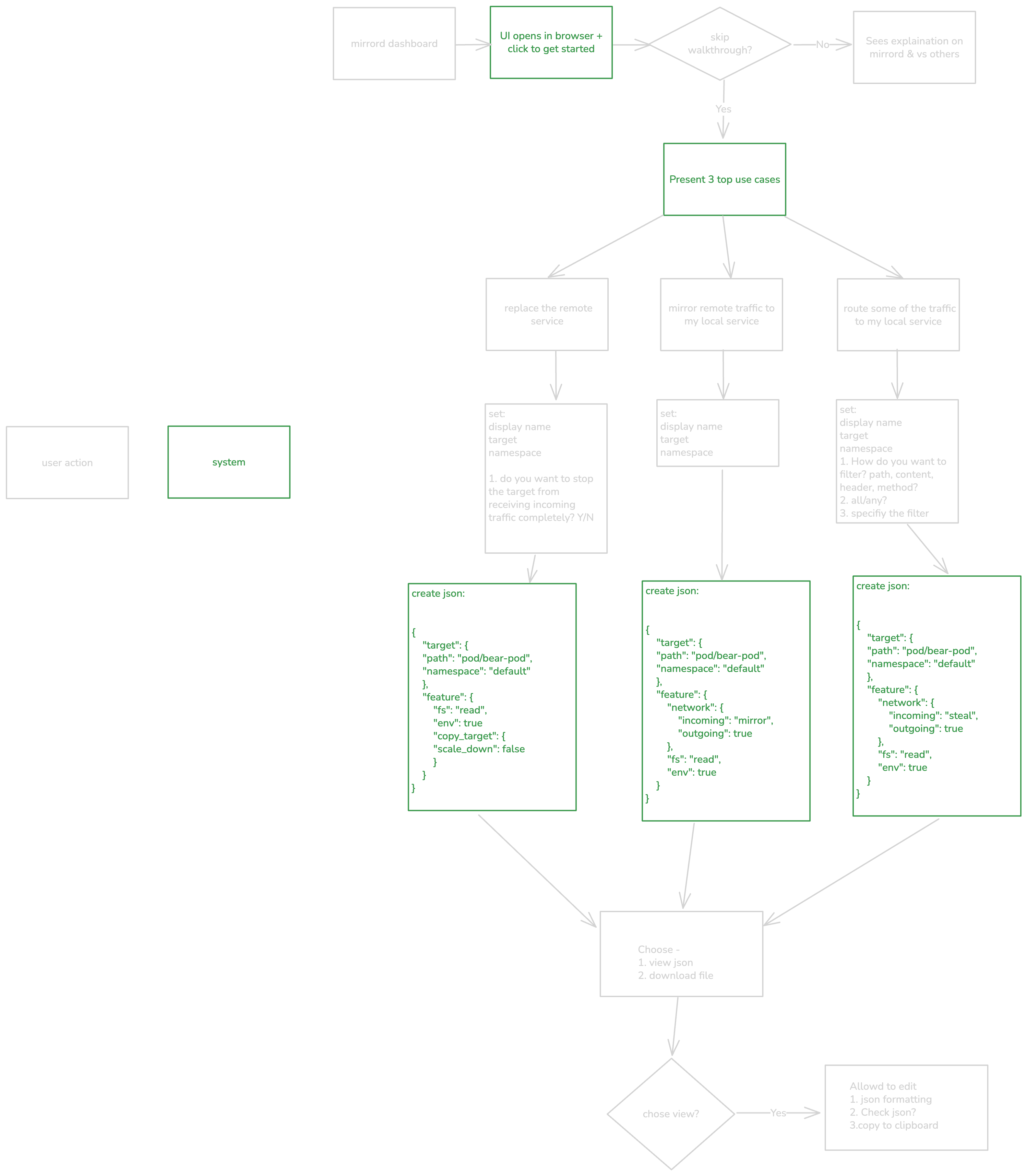
Liron's user flow diagrams in Excalidraw
What impressed us immediately about Lovable was how good it was at taking simple prompts based on just the user flow we wanted and turning them into screens. Not having an existing frontend actually worked in our favor, since creating things from scratch was much easier than having the LLM understand and follow an existing design language.
The biggest benefit was that it allowed us to skip the mockup design step entirely. Traditionally, we would have had to explain to a designer how to take the user flow we mapped out in Excalidraw and turn it into a UI, and then have a frontend engineer start building from those mocks. Lovable did both jobs for us, saving a lot of time!
We were particularly impressed by how Lovable could take a prompt about the functionality we wanted and translate it into a clear UI. For example, we asked for a component where a user can pick a port to filter traffic from and then optionally map that port to a local port. That’s actually two separate functionalities combined into one component, which was pretty complex to explain to an AI agent. Still, it provided a working output almost immediately. All we had to do was improve the design visually, but the functionality was already there.
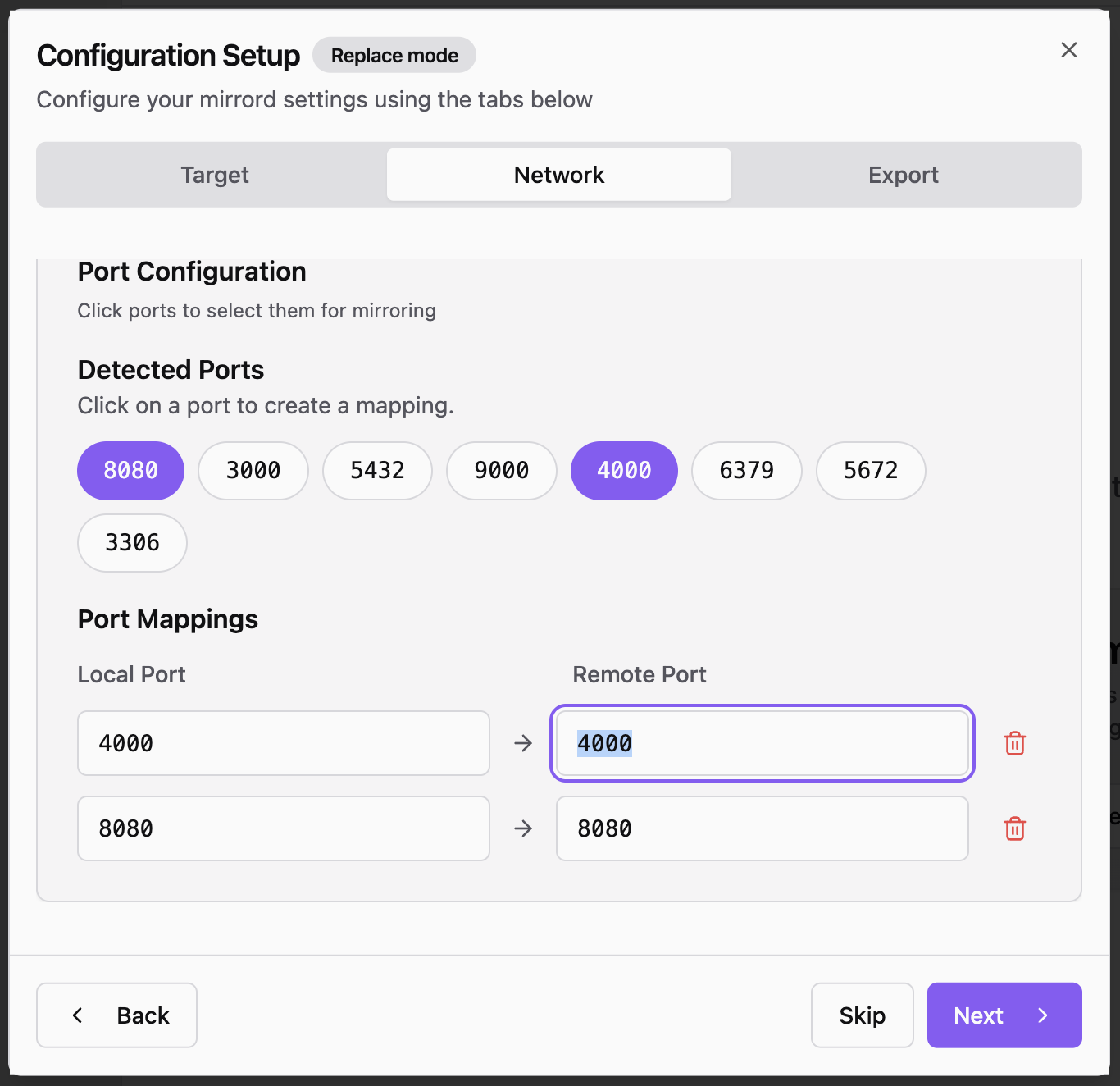
The UI Lovable came up with for the port configuration component
In some instances, Lovable’s attention to detail, even without being explicitly told what to do, was also amazing. For example, in the input fields part of our onboarding wizard, it surprised us with great built-in input validation by showing users the right error messages immediately without us needing to spell them out.
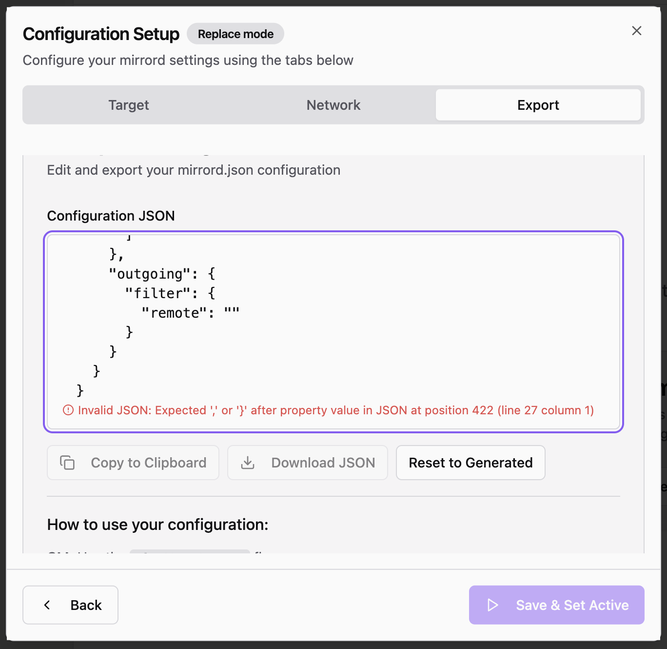
Lovable added input validation for JSON in the component
The Bad
Working with Lovable wasn’t a smooth ride throughout . One of the most frustrating parts was that Lovable built each screen in isolation, forgetting the wording and structure we’d already defined previously. Every new component felt like starting from scratch.
We tried solving this by creating a style guide, and it worked for a while, but then the same issues started to resurface. Some things, like colors that were part of the style guide, stayed consistent across components, but others, like fonts, did not. So human supervision was needed at every step, instead of being able to trust it to do the right thing consistently.
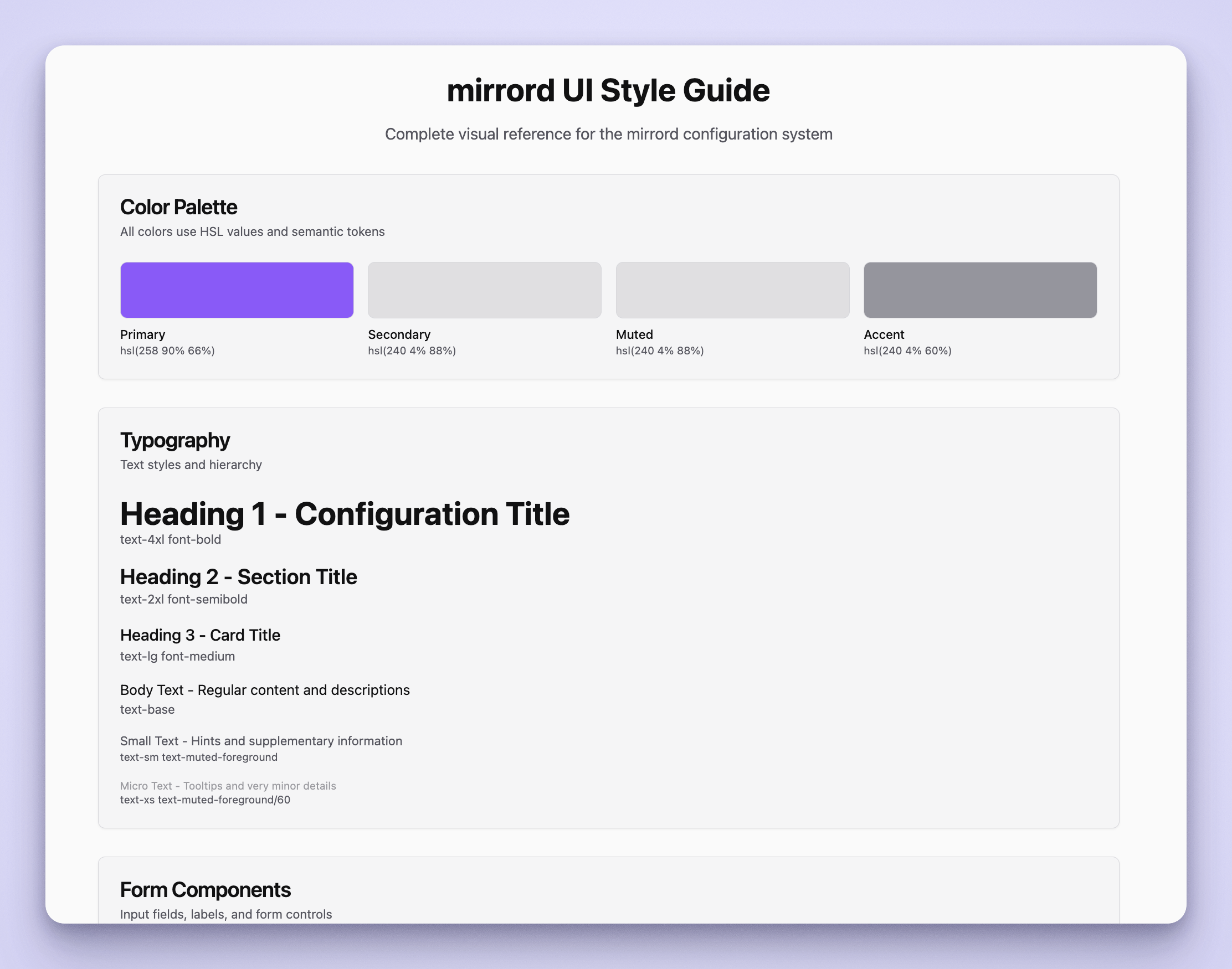
The mirrord style guide we created for Lovable
A lot of times when we asked it to build a component, it would look a certain way after the first prompt, but then after requesting changes, the text or labels within the component would suddenly change, even when we hadn’t asked it to.
It was clear that Lovable didn’t really remember the context of previous conversations like ChatGPT does. If we built a screen again, we had to redefine everything: that the dropdown should take the full row, that the wizard should be minimal but comfortably sized, that the modal should have a fixed size with natural internal scrolling as components expand, and so on.
And as we added more screens, things got messier. For example, at one point it didn’t understand that a button in a window should lead back to the overview wizard despite us mentioning it in the prompt. We had to explicitly tell it to stop linking the button to old screens that were no longer in use and link to the correct one instead. Things like these made the experience a little frustrating.
The Ugly
What we complained about earlier could still be called hiccups in the user experience of a tool that mostly did a pretty good job. However, we did hit one wall where Lovable just couldn’t get the job done.
After building the first version, we wanted to add keyboard shortcuts for each step of the onboarding wizard. For some reason, the tool completely broke down here. It only managed to add shortcuts on the first page and failed to support them on the others. At that point, we realized that instead of continuing to spend hours fighting it and re-explaining things, it would be much faster to hand this task off to one of our engineers, so that’s what we ended up doing.
Verdict
Before we give our verdict, it’s important to re-emphasize our specific situation. We’re a team of backend and low-level engineers with a severe CSS allergy. No frontend engineers and no designers.
Given all that, the fact that we could generate a fully designed UI for an onboarding wizard for our tool, is a huge time-, energy-, and money-saver for our team. It’s something we didn’t really have a proper alternative for until now. The early feedback from our customers about the onboarding wizard has also been great. For us, this would mean better user experience, less support time, and quicker onboarding of our customers.
Now we don’t know if Lovable did as good a job as a professional UI or UX designer would have. But it got us to a good-looking prototype fast, and one that our engineering team would be able to take all the way to production without being frontend pros. And in our case, that’s what mattered most. It’s like they say, perfect is the enemy of shipped :)